CROWN PAINTS LTD
PO BOX 37
CROWN HOUSE
HOLLINS ROAD
DARWEN
LANCASHIRE BB3 OBG
Tel: 0330 024 0310
Fax: 01254 774414
Suppliers of: TIMONOX paint fire retardant paint TIMONOX Flame Retardant Coatings crown sandtex paints
The Crown Trade Range for Professional Specifiers & Professional Decorators.
Social Media: Facebook / Twitter / LinkedIn
Videos: YouTube
The solutions we offer for effective paint specification – and the way in which we deliver them – stem from our self-belief that, where Crown is concerned, “it’s not just paint… It’s personal”.
We offer a variety of personalised services for specifying coatings such as:
- Extend maintenance cycles with effective paint specification
- Site specific surveys and assessment of environmental condition
- Help producing tailored cyclical maintenance programme
- Guidance on fire safety
- Colour scheming, including computer aided design and face to face consultations
- On-going on-site support for your projects
- Sustainable smart maintenance solutions for your project
- CPD accredited presentations
- BIM objects available for Crown Trade, Sadolin and Sandtex Trade products
- Add colour information to your plans with our downloadable colour palette
- Representation under Common Arrangement of works category M60 on the widely used NBS plus system
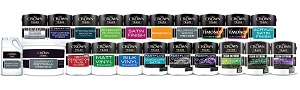
- Superior quality product solutions for all your interior and exterior projects from our Crown Trade, Sadolin and Sandtex Trade
Crown Paints has a dedicated App
The MyRoomPainter app which is a free online tool designed to enhance the specification of Crown’s paint and wood protection products - enabling clients to see precisely how rooms will look in any particular colour. Available free on Google Play and the App Store.
CROWN PAINT FOR SPECIFIERS Click Here
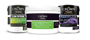
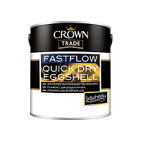
The Crown Trade range provides a comprehensive variety of high quality finishes that can be relied upon for many years. Reliability is achieved not simply through excellent product quality, but by maintaining an extensive support service providing expert knowledge, guidance and assistance in all areas of product specification and use.
If you can’t easily find what you’re looking for on the web site, our Specifcation Seervices Team will be pleased to assist - just call 0330 0240310 for friendly advice, or send us an e-mail using the ’email’ button above.
Our other famous brands for Trade customers include:
SANDTEX MASONRY PAINT Click Here
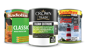
The range of Sandtex Trade products has been developed from over 40 years of experience in masonry coatings. Sandtex Trade products are specially formulated to enable repair, preparation, decoration and long lasting protection of masonry substrates and joinery. This unrivalled systems approach ensures optimum performance, whatever your chosen finish.
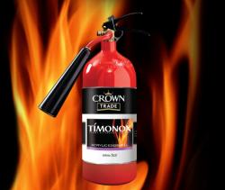
TIMONOX FLAME RETARDANT COATINGS Click Here
By helping restrict flame spread, Timonox systems can provide additional time for the evacuation of buildings and assist in limiting damage prior to the arrival of fire fighters. And with up to 200 shades available, the Crown Trade Timonox range does not compromise on choice of colour.
SADOLIN Click Here
The Sadolin exterior range provides coating solutions for many substrates and offers the protection needed from the harmful effects of weathering, and other natural enemies of timber such as dirt, surface mould and decay; from preservative pretreatment through to finishing coats.
Sadolin also have a fantastic interior range, comprising of both solvent and water borne coatings including PV67 Heavy Duty Varnish, Polyurethane Varnish and Polyurethane Floor Varnish.
Utilising colour and design for mental health
 Health and wellbeing is extremely important and should be a key consideration on any design project in order to counteract the stresses of modern life. This World Mental Health Day, we’re highlighting the positive impact colour can have on emotional states and how it can impact audiences.
90% of our time is spent indoors – either at school, work or home – therefore, the emotional impact of design should be a key consideration for any project. Holistic therapy focuses on a person as a whole – the mind, body and spirit – the inner and outer environment. Holistic design follows the same principles – a comprehensive review of everything from furnishings, layout, lighting, colour and then the things we don’t see, such as air quality, odours, sound and temperature.
Balance in interiors is key for successful design – tactile fabrics, decorative lighting, appealing smells, attractive colour schemes and natural elements e.g. plants all interplay to create a positive multisensory experience. In contrast, harsh sounds, nasty odours, mess, hard lighting and distracting patterns can overwhelm the senses and cause stress. A lack of stimulation can be just as bad.
When designing a space, it is essential that it meets the needs and requirements of its users, whether that be for learning, social interaction, dining, exercise or relaxation. Colour psychology explores the impact colour has on human behaviour, and while this remains an area where there is so much more to learn, continuous research is enhancing our knowledge and understanding of colour.
“Colour is so incredibly personal and we all respond differently to it. We can use it as an extension of our personalities – loud and expressive or calm and understated. It can set the tone and create a mood. All aspects of a colour can affect how it is perceived – light colours are fresher, chalky are quieter, dark tones are more grounded, mature, refined and vibrant colours are loud and energetic.”
Jemma Saunders – Crown Colour Consultant
Use these insights to inform your colour choices when designing a space:
Red
Strong, deep red hues symbolise tradition and history and when paired with subdued lighting can create an intimate and relaxing atmosphere. More contemporary vibrant reds can make a statement and stimulate excitement.
Pink
Soft hued pinks are welcoming and can create feelings of warmth, serenity and calm, whereas strong, vibrant pinks are vivacious and fun.
Orange
Orange symbolises health and vitality. It sits on the warm end of the spectrum and like red it is regarded as a warm colour. There are many variations of orange, in addition to the bright orange colour of the fruit, from coral, to clay, copper and burnt sienna.
Yellow
Yellow is regarded as uplifting and is often used in children’s classrooms or in areas of creativity. Lighter shades of yellow are gentle and fresh whereas darker, mustardy tones of yellow can insight grandeur and opulence.
Green
Greens are seen as restful and harmonious. Paler shades of green are perceived as fresh and cooling; yellow-greens tend to be energising and are more playful; blue-green shades often evoke calmness and clarity; and darker greens can be reminiscent of forests and are seen as stable and constant.
Blue
Blue sits at the opposite end of the spectrum to red and where red is warming and energising blue is cool and calming. Dark blues are sophisticated and serious whereas pale blues are seen to have tranquil effects as they suggest openness and air.
Purple
Purple is a colour long associated with royalty. Dark purples create a moody atmosphere and work well combined with rich sumptuous textures. Lavender is often used in holistic therapies for its sedative and relaxing benefits.
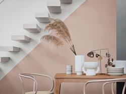
White
White walls styled with minimal colour or accessories create an understated and tranquil ambience. White in an interior can make a space feel larger as it reflects more light and opens up a space or it can act as a backdrop for stronger colours.
Neutral
Neutrals refer to a broad spectrum of colours that contain little colour pigment. Neutrals are classic and timeless colours that can be used as a backdrop allowing statement colours in furniture and furnishings to shine and is definitely not just limited to magnolia!
Grey
Greys are versatile in an interior, they work with a multitude of hues and are regarded as low intensity colours. They can be warm or cool and lend themselves well to modern spaces.
Black
Over recent years there has been an increase in black interiors, black walls, finishes and furniture, and contrary to popular belief, small spaces can suit dark interiors. Monotone schemes can be restful and calming when balanced with a sympathetic use of light.
These guidelines are not set in stone and will be slightly different between various audiences and cultures. Afterall… it’s not just paint, it’s personal.
Speak to a Crown Colour Expert today to get expert advice on utilising colour to its full potential to create the perfect environment.
If you or someone you know are looking for mental health advice or support at this time, visit Mind for expert guidance.
Crown injects new life into Manchester’s Holden Gallery
 Crown has made a colourful mark this summer, working alongside the Manchester School of Art to create a show-stopping exhibition in the heart of Manchester Metropolitan University’s city-centre campus.
Partnering with renowned artist Lothar Götz, a new immersive site-specific wall installation – entitled Poole – has been created, wrapping around the 4 four walls within the well-loved space.
Götz, who is best known for his bold and creative use of abstract colour, geometric shapes and forms, responds to spaces and their architectural features, allowing this to underpin his design work.
Poole is a new commission which has transformed the Holden Gallery into a vibrant, colourful receptacle, completely altering the viewer’s experience of the space. With each wall covered in an eclectic mix of hues, the space has been stripped of all furniture and artwork, allowing the colours and shapes that impose to tell a story without distraction.
Crown were initially approached by The Holden Gallery and were keen to support the project after learning about the nature of the exhibition. Working with Crown Decorating Centres’ Manchester store, an impressive array of more than 20 colours – in Crown Trade Vinyl Matt Emulsion – were donated to the gallery.
“We are delighted to be reopening the gallery with Lothar Götz’s wall painting Pool. After remaining closed to the public since March 2020, and having delayed the show by a year, it is a pleasure to finally welcome visitors back to experience this joyful, vibrant installation in the gallery.”
Zoe Watson – Curator of the Holden Gallery
“We’re always looking for inspiring projects and artists to support and ways in which we can inject some colour into the communities around us. We believe that every pot of paint is brimming with potential and what better way to show that than by supporting projects such as this one.
We know what a positive difference our paints can make to people, that’s why we will keep pushing what’s possible”.
Josie Cawdry – Corporate Communications, Crown